Design trends arrive every year, and most of them are judged by how they look in a portfolio rather than what they do to a company's conversion rate. We build sites that have to pay for themselves, so this is the trend list filtered through one question: does it help a visitor understand the offer and act on it? Here is what holds up in practice and what to leave in the mockup.
Speed is the first design decision
The fastest-growing trend is not visual at all. Visitors and Google both reward pages that load in under two and a half seconds and do not shift around while loading. One client's rebuild cut load time from six seconds to under one, and conversions rose 41% before a single word of copy changed. Compressed images in modern formats, fonts loaded with a fallback, and no unused scripts do more for revenue than any hero animation.
Glass, depth, and motion, used sparingly
Translucent navigation bars, soft shadows, and gentle reveals on scroll give a site a current feel and cost almost nothing in performance when done with CSS. The rule we hold to: motion moves elements, it never hides text. Copy that starts invisible and fades in is copy a search engine or an impatient visitor may never see. Animate position and scale. Leave opacity for decorative elements.
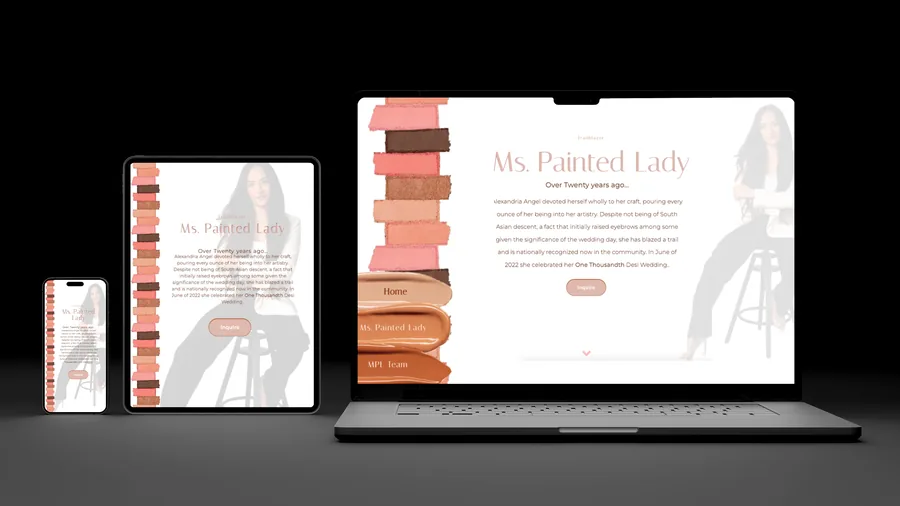
Mobile-first means thumb-first
Most first visits happen on a phone, so the primary action has to sit where a thumb rests, usually the lower half of the screen. Tap targets need to be at least 44 pixels, phone numbers must be tappable, and forms should ask for as little as possible. Designing the desktop version first and squeezing it down later is how you end up with a beautiful site nobody can use in a parking lot.
One clear action per screen
Pages that convert give the visitor one obvious next step at every scroll position: call, book, request a quote. Sites that offer six equal buttons convert like sites that offer none. This is the trend toward calmer, less cluttered layouts, and it is grounded in how people actually decide.
Real photos of real work
Stock imagery of smiling models has become invisible. Photos of your team, your shop, and finished jobs build trust in a way no illustration can. If the budget only allows one investment beyond the build, spend it on a half-day with a photographer.
Structure that AI search can read
ChatGPT, Perplexity, and Google's AI Overviews pull answers from pages with clear headings, direct sentences, and accurate structured data. Sites designed as clean, well-organized documents are being quoted; sites built as image collages are not. This is the same structure that helps classic rankings, so there is no trade-off.
Accessibility is a conversion feature
Readable contrast, visible focus states, and text that scales are often filed under compliance. They also make the site usable for the customer squinting at a phone in bright sun. Every accessibility fix we make on a rebuild shows up as a small conversion gain.
Trends to skip
- Autoplaying video heroes. Heavy, distracting, and usually stock footage.
- Scroll-jacking. Taking control of the scroll wheel frustrates more people than it impresses.
- Cursor gimmicks. Fun on a design showcase, meaningless on a phone, and confusing for older visitors.
- Mystery navigation. Hiding the menu behind an unlabeled icon on desktop to look minimal.
Pre-launch checklist
- Load the home page on a phone over cellular data. Under three seconds, no layout jumps.
- Every page has one primary action visible without scrolling.
- All copy is visible with JavaScript disabled.
- Phone numbers, addresses, and hours are text, not images.
- Every image has a real description and is served in a modern format.
- Structured data validates and describes only what is on the page.
A website is a salesperson that works every hour of the day. Judge its design the way you would judge a salesperson: by what it closes.